Storecake
Creat and manage sales websites.
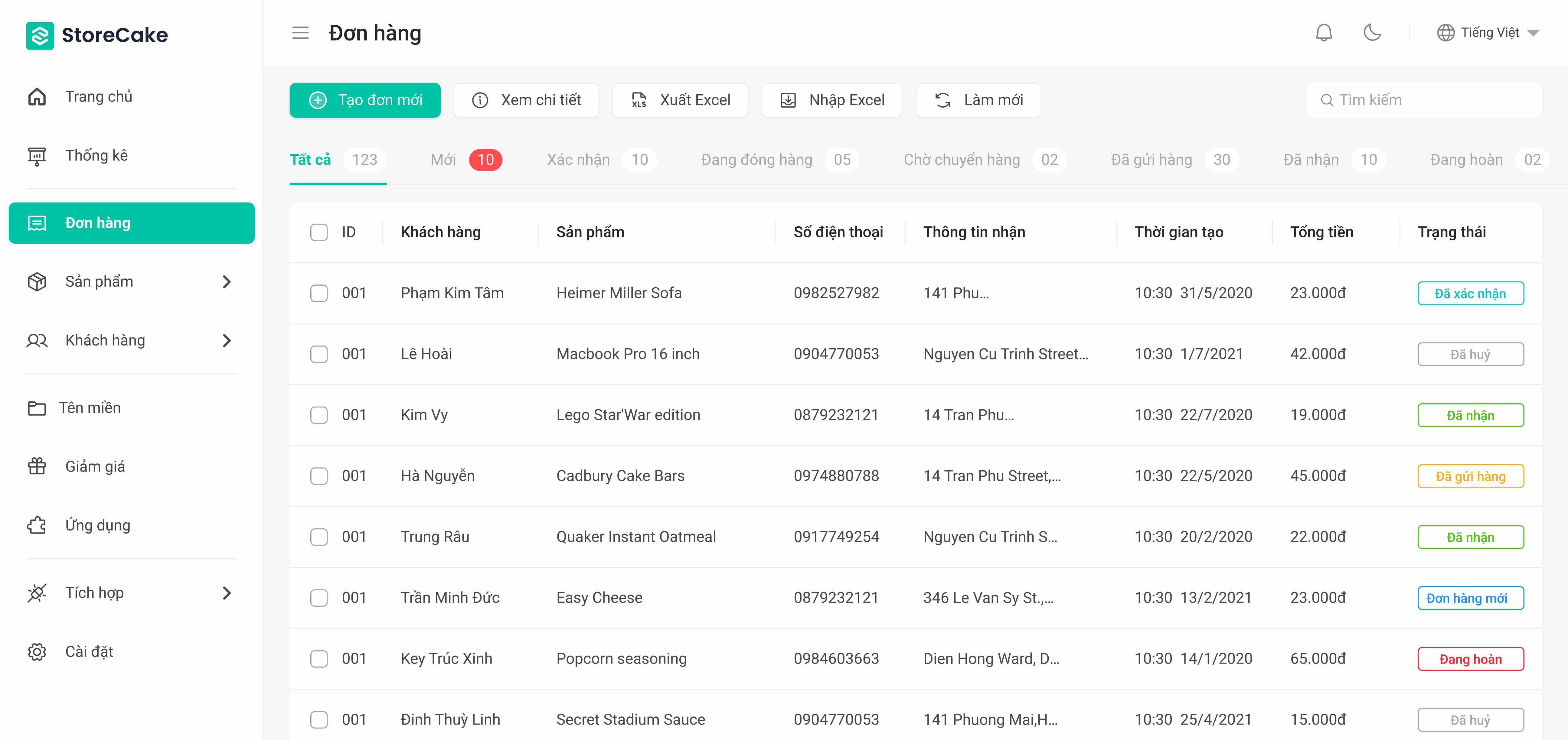

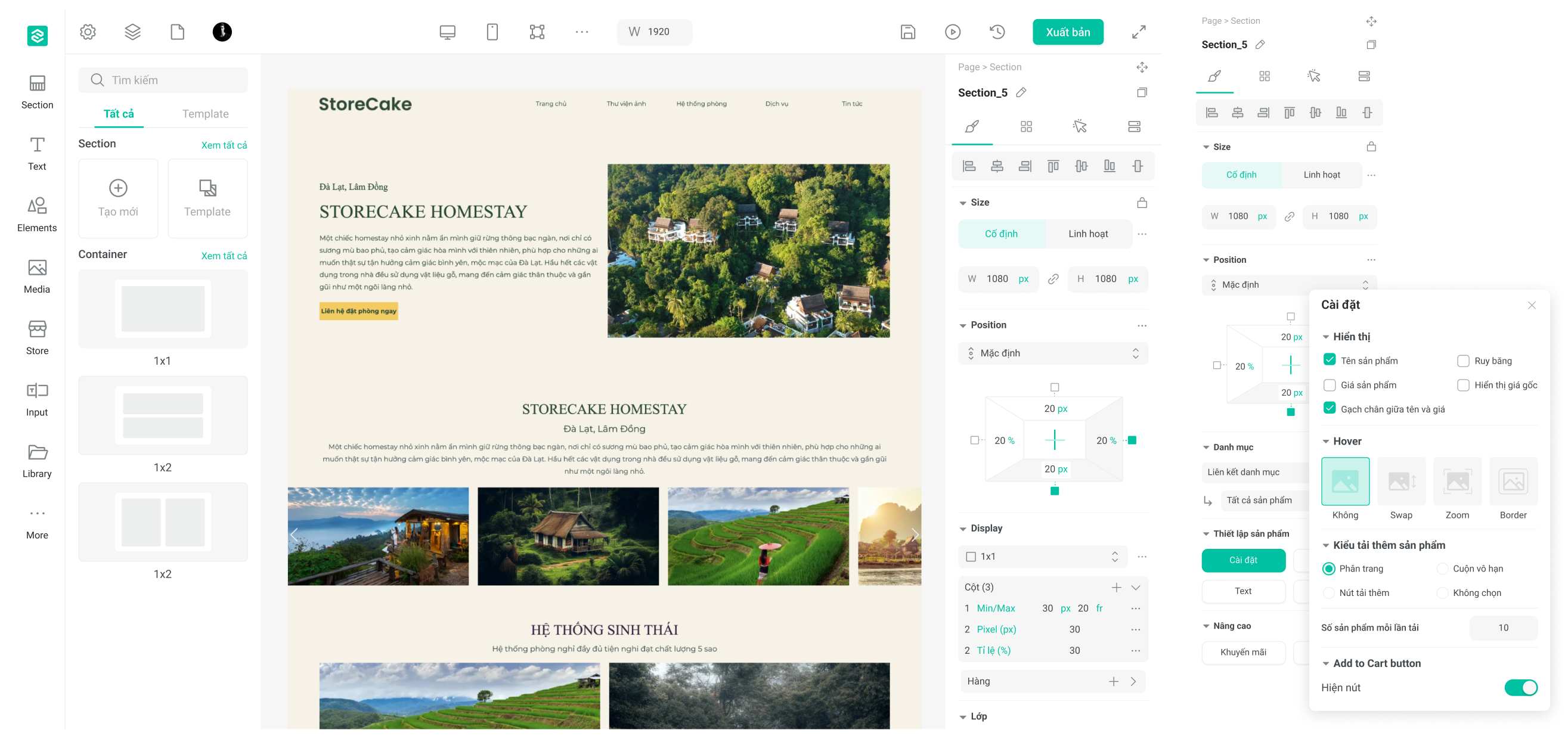
Storecake.io is a platform designed for creating and managing sales websites. It is part of the Pancake ecosystem, which includes various tools for business management and online sales.
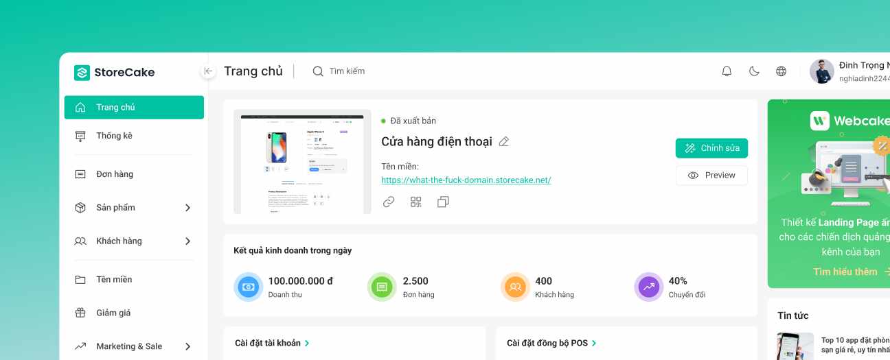
At Pancake, we believe that a strong brand identity is the cornerstone of a successful business. Our branding strategy is meticulously designed to reflect the core values and mission of Storecake.io, ensuring a consistent and memorable experience for our users.
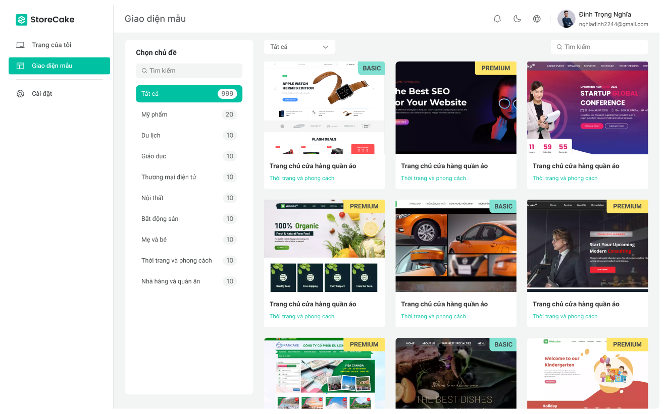
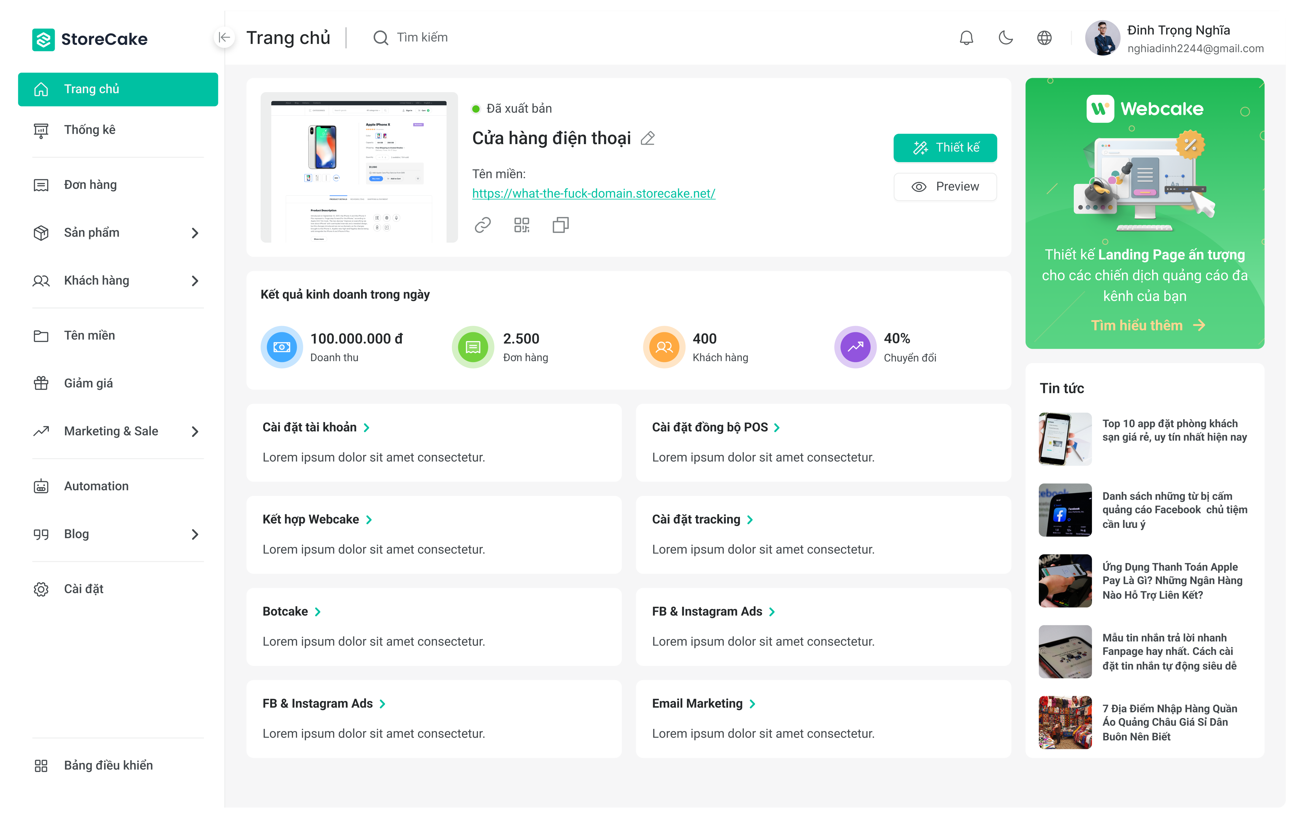
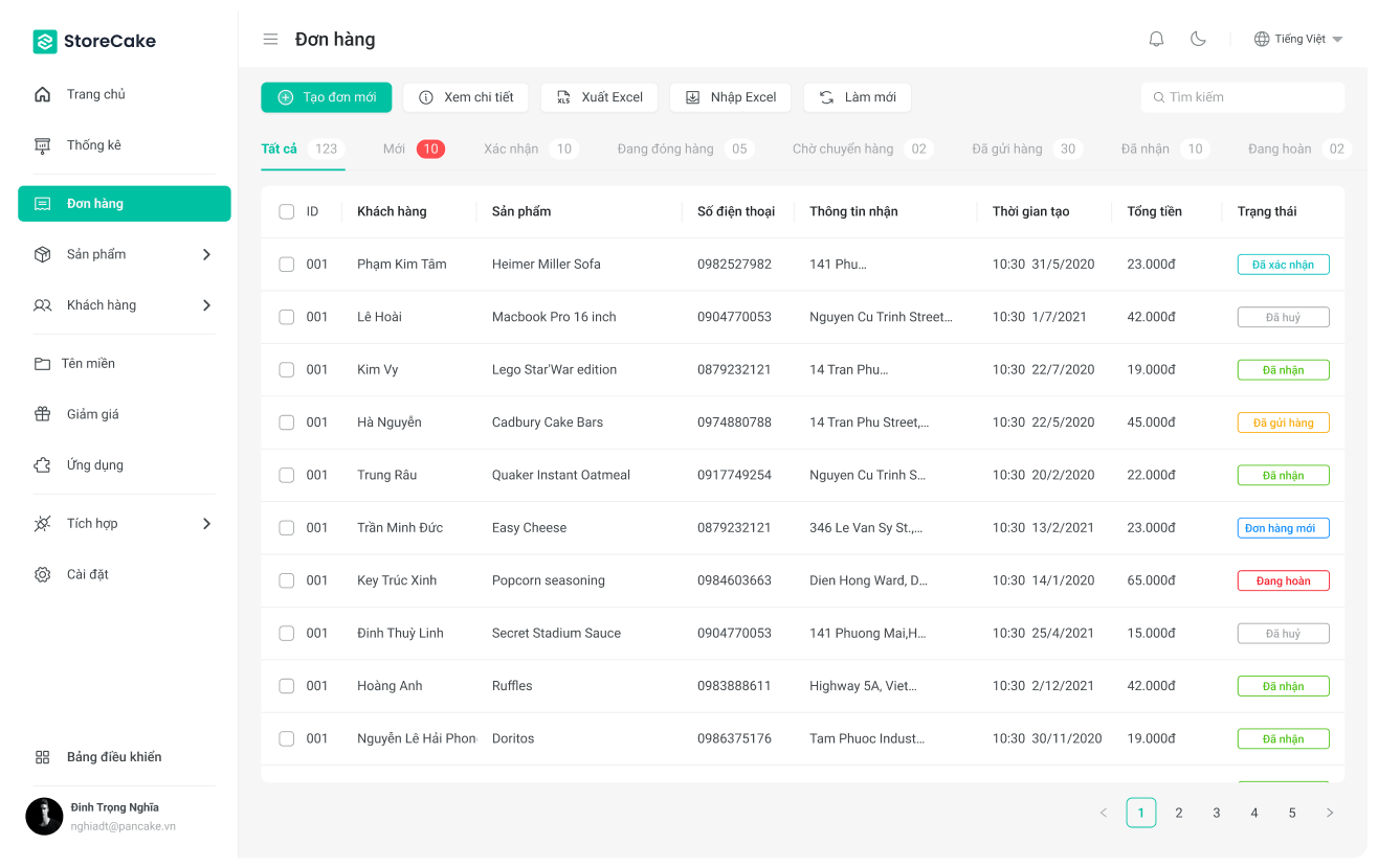
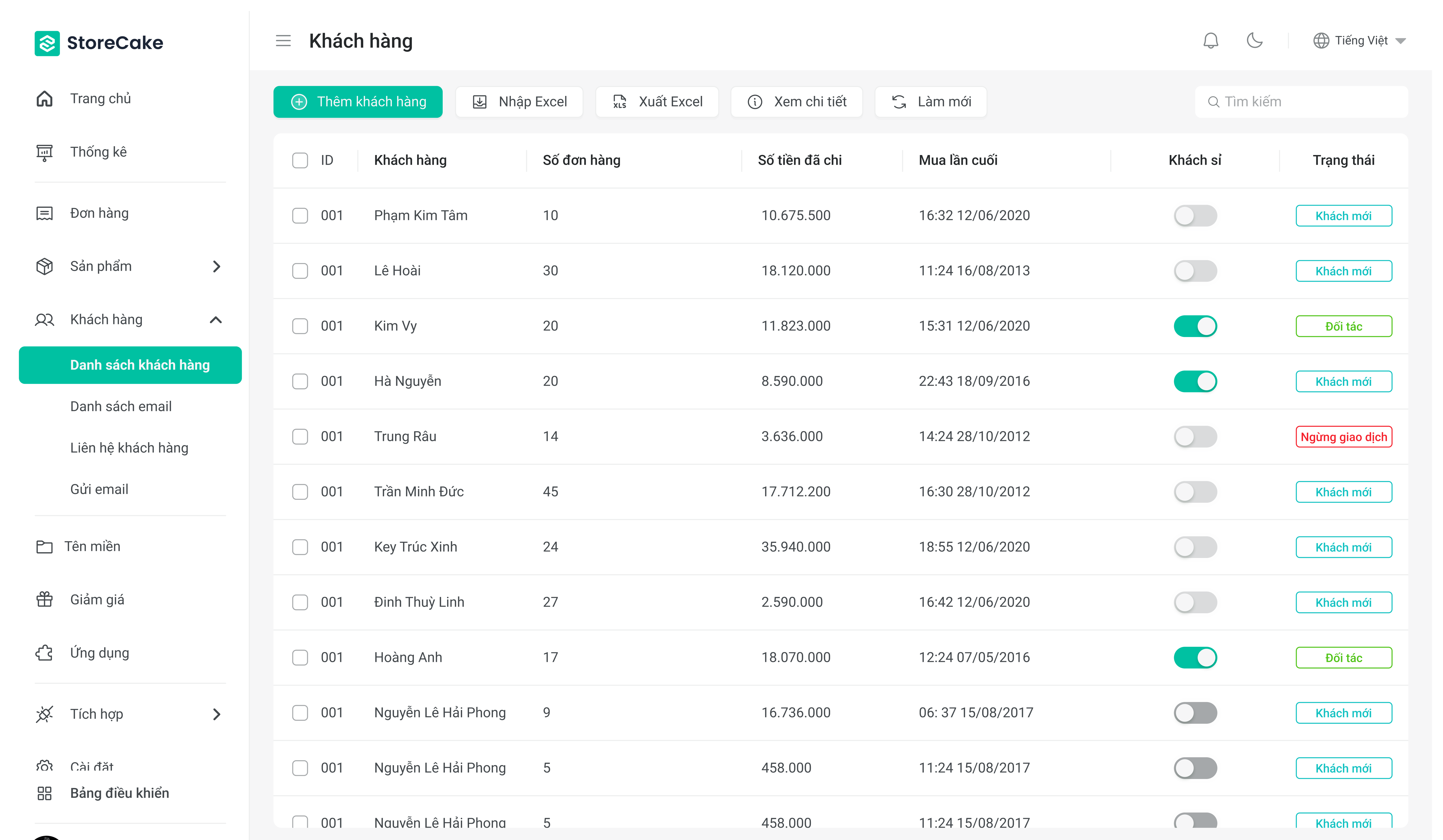
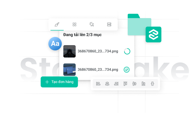
The Storecake Design System is the backbone of our user interface and user experience design, providing a cohesive and scalable framework for all our digital products. This system ensures that every aspect of our platform is both aesthetically pleasing and highly functional, allowing for a seamless user experience across different devices and touchpoints.
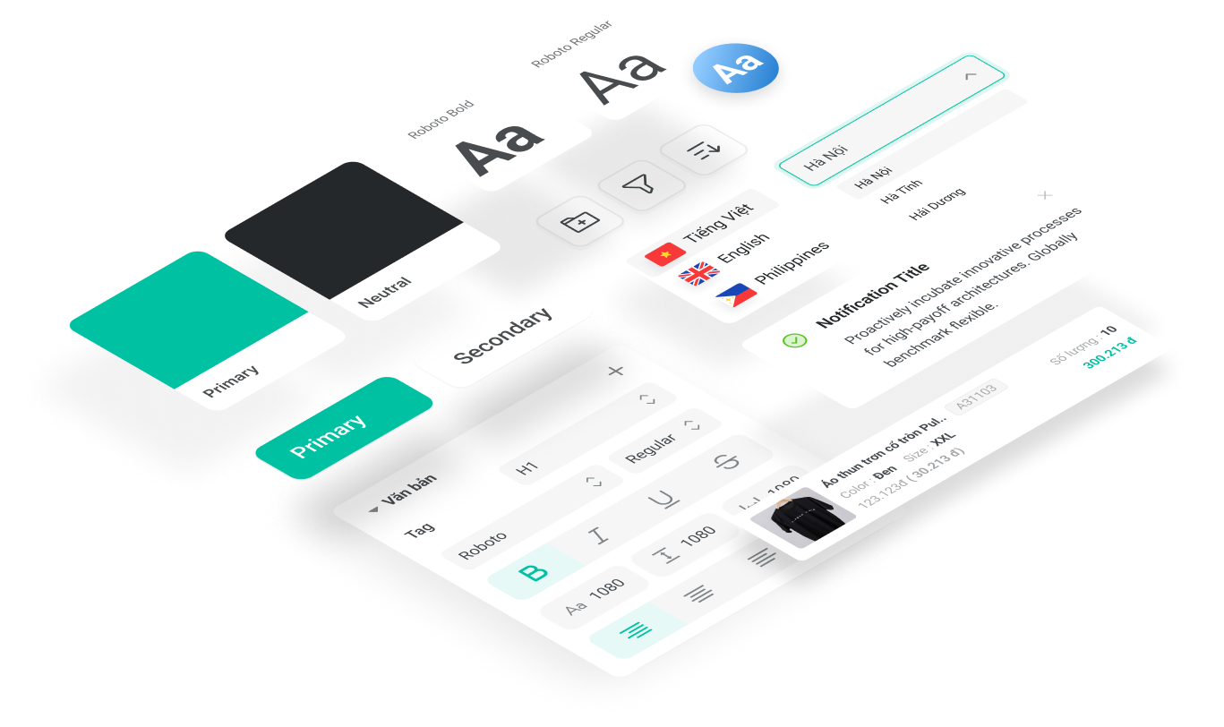
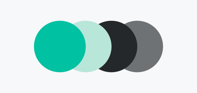
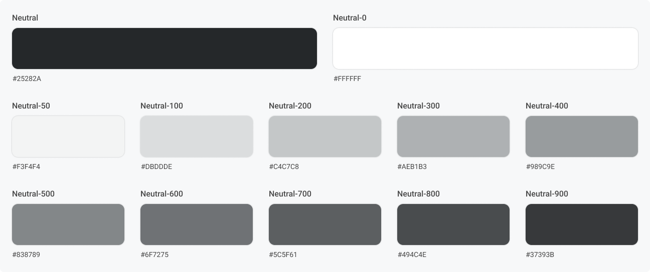
The color system in the Storecake Design System is carefully curated to enhance visual appeal and usability. Our colors are selected to evoke trust, reliability, and innovation, which are central to our brand identity. We also include guidelines for color usage to maintain brand consistency and ensure optimal contrast for readability.


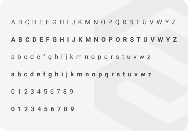
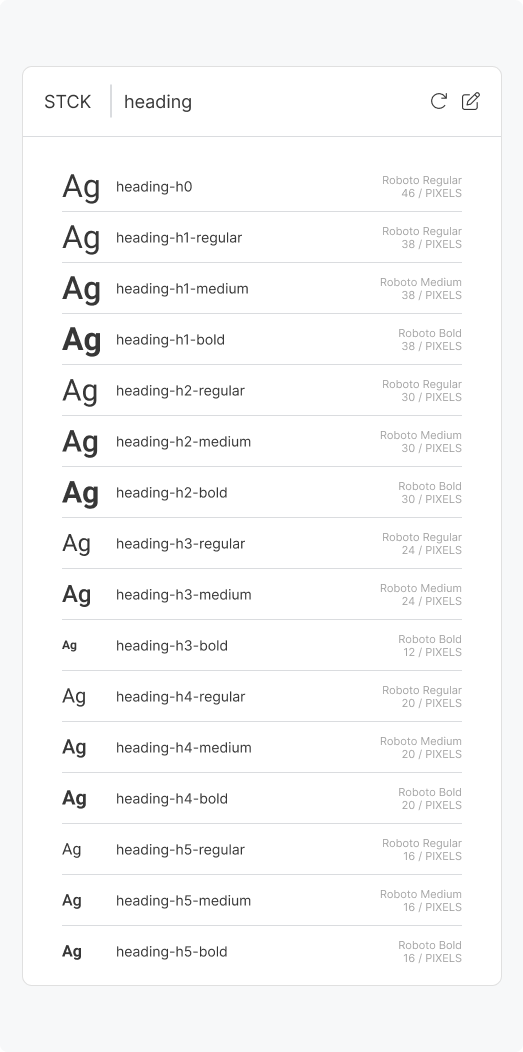
Consistent and readable typography is a fundamental part of our design system. We use a modern, sans-serif typeface that ensures clarity and accessibility. Our typographic hierarchy defines the styles for headings, body text, captions, and other textual elements, maintaining a uniform appearance throughout our platform.
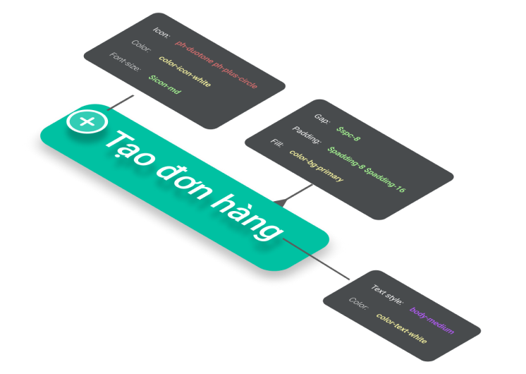
To achieve consistency and optimize user experience, we have developed a robust Design Token system. StoreCake's Design Tokens serve as the fundamental components that synchronize design and development elements across the entire platform.
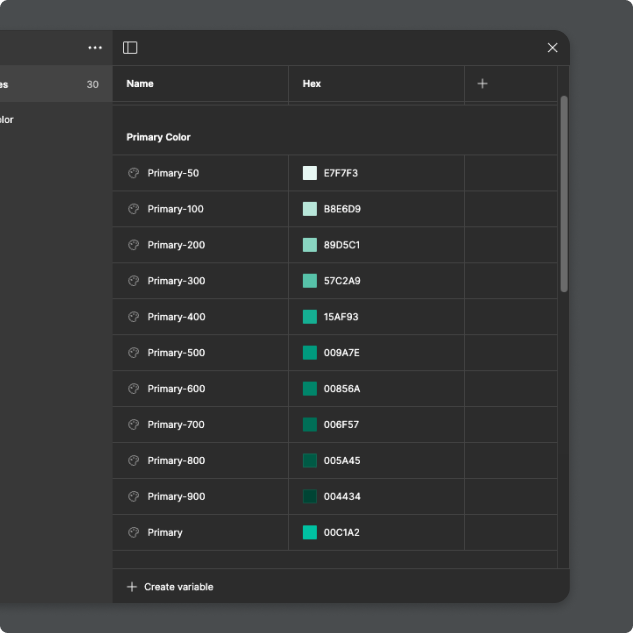
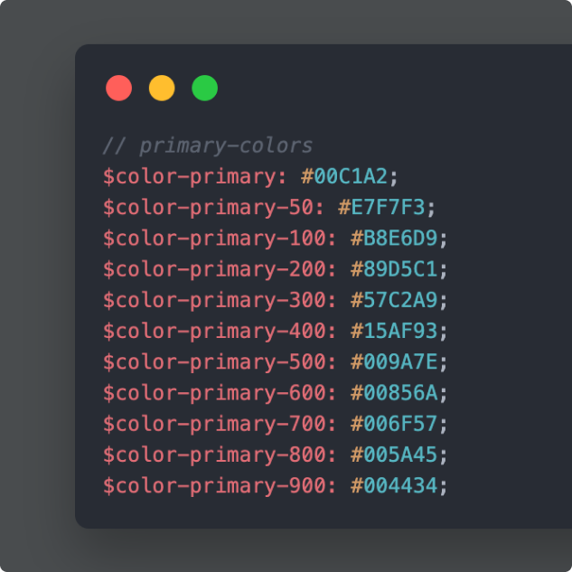
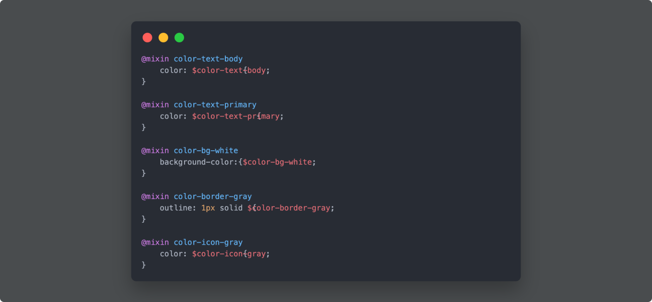
The Storecake Design Token Color System is a foundational element of our design framework, aimed at ensuring visual consistency, accessibility, and efficiency across all digital products. By defining and standardizing color values, this system serves as a single source of truth for designers and developers, streamlining the workflow and enhancing collaboration.

Typography variables include font-family, font-size, font-weight, and line-height, ensuring text consistency.
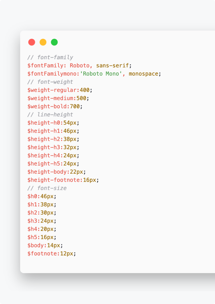
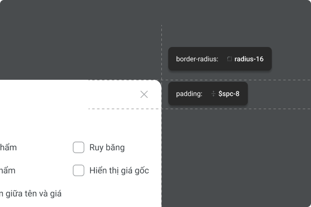
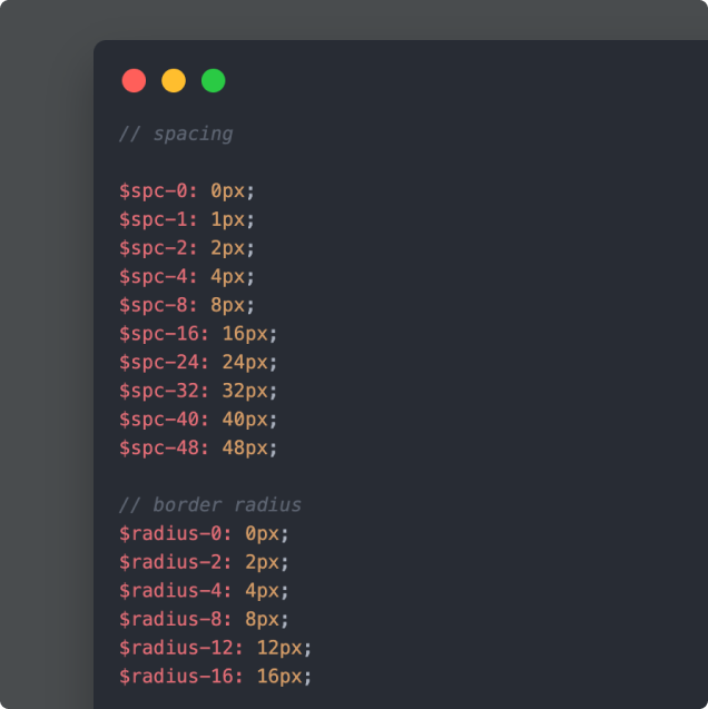
Clearly defined sizes and spacing between elements create a harmonious and visually pleasing layout.
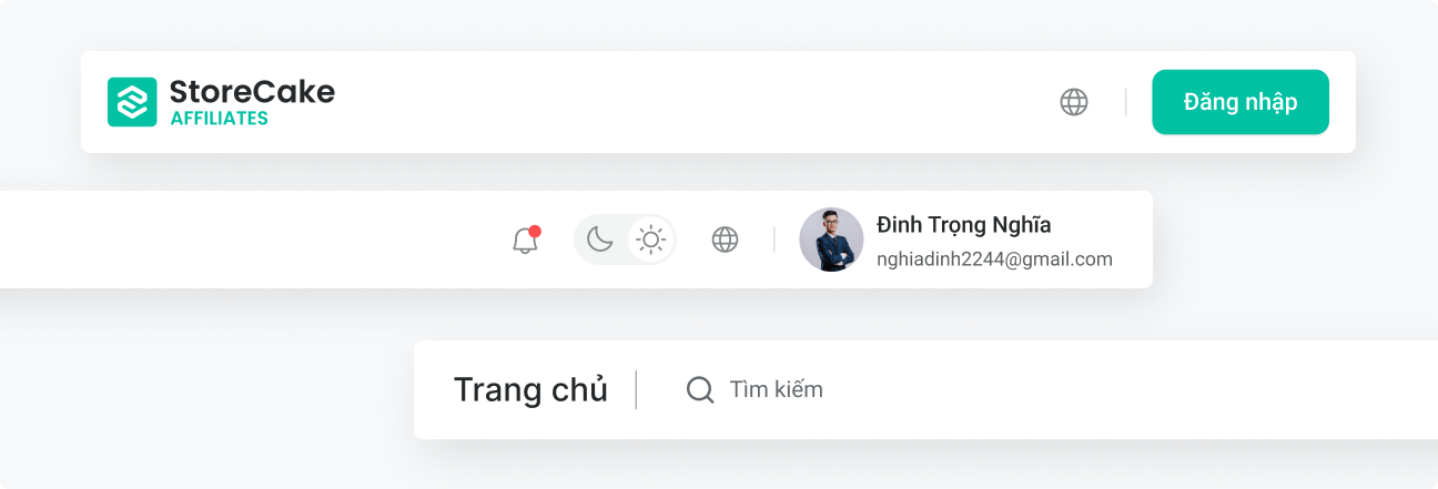
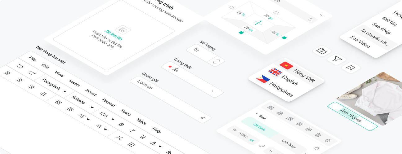
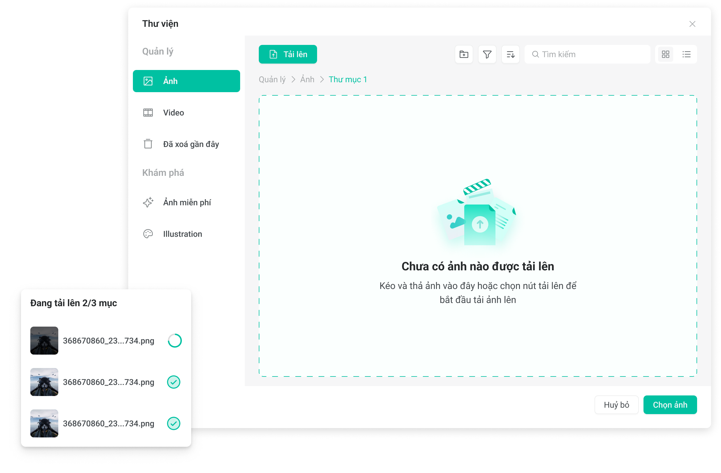
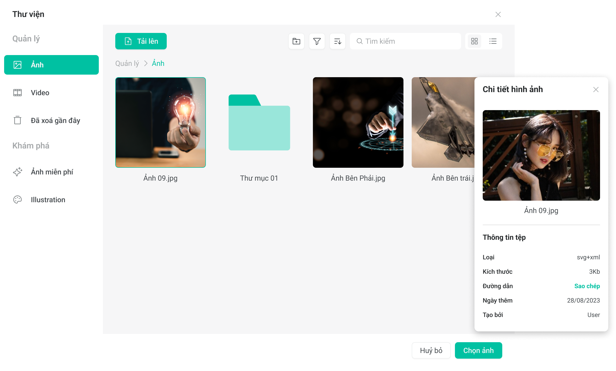
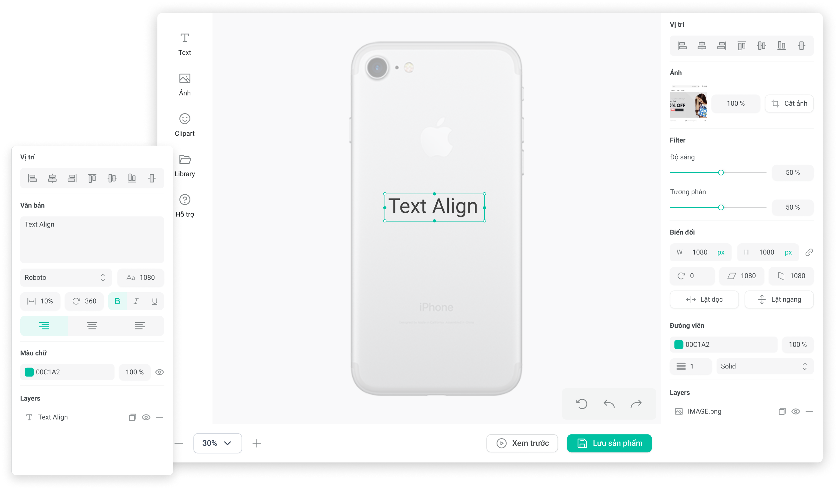
Our component library includes a comprehensive collection of reusable UI elements such as buttons, forms, modals, and navigation bars. These components are designed with flexibility and consistency in mind, enabling our development team to build and iterate quickly without sacrificing quality or coherence.
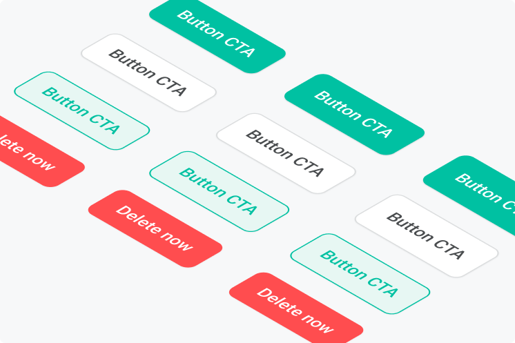
The button component in Storecake’s design system is crafted to ensure both aesthetic appeal and functional excellence. As a fundamental UI element, our buttons are designed to enhance user interaction and improve the overall user experience on the platform. For more infomation, check out Storecake Design Library.
